The Creation of a Modern Commercial Application
Restrictions: One Developer, Zero Outside Funding, One Month
Today we will take up the case of making a modern commercial application in today's economy with the most current technical trends and user proclivities in mind. We will show how a one person team—with a singular vision and a unified toolset—can easily and quickly create an application that meets stated modern standards with no outside funding in the calendar period of one month.
We will define an application as: the minimal software needed to solve a stated problem or create a desired fulfillment for its user.
Process
Groups like Information Architects Japan use processes involving the intersection of technology, economy and design groups to define a successful user experience (UX in the diagram below) in a staged process.

Start with the User Experience
Rather than deducing the user experience through a long process of study and debate, we will begin with it. The single software developer/business person in this approach is the user. The successful single developer creates an application that fulfills his/her own desired user experience. This factor lowers costs, lowers risk and insures success more than any other.
The developer may choose (and wisely so) to discover the extent to which others crave his own user experience and are not finding it in the marketplace of applications. This can be easily done through social networks, listservs, forums, bulletin boards and analog (physical) social situations.
The user's desired experience:
I need a simple system of creating and receiving reminders that I can actually use whether I'm at my computer or using my cellphone.
This user needs a system of reminders that go wherever he goes. This application needs to be simple, single purpose, and easy-to-use from anywhere at anytime.
Feedback gathered from peers:
Sometimes I know I need to do something, but I haven't decided when I need to do it. I need to keep track of things like that.
My calendar software requires so much work just to make an appointment. It doesn't really do reminders, which is what I'd really like.
Why can't I just write a quick reminder to myself and have it appear as a text message on my phone at the moment when I need reminding? I always have my phone.
A picture begins to form: a column of reminders with specific dates and times associated with them; another column of reminders that have no time associated with them.
Reminders are defined as: text that may contain directions, time of an appoint, the amount of a bill to pay...anything the user does not want to forget.
To meet the user expectation, the following needs to be conceptualized in the form of one or more screens:
- a storage area for timed reminders
- another for reminders with no time associated
- an interface for attaching or un-attaching time to reminder
- a means of delivering reminders
- destination(s) to which reminders are delivered
The common mistake of developers who are in business for themselves is their tendency as engineers to look to closely at the work of others and to copy it—or worse, to do it one better. This is not an issue of originality, but of appropriateness and points to the very definition of a kludge. The result of this unfortunate practice means that features not appropriate to a user benefit or expectation appear in an application.
Crude prototypes, often sketched on yellow pads or cocktail napkins, seem to have a much better track record of becoming viable apps than any other mode of conceptualization.
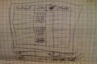
The concept of the parking and unparking of timed and parked reminders is rendered from desired user experiences in the above diagram. The need to create something unique, do something cool does not enter into the equation.
There remained the question of delivering reminders. Delivery to a phone where the phone was actually awakened was best delivered by text messaging. Getting a reminder to the user on his computer was best done with email. User experience bore this out.
There were several delivery candidates, but, given its current and anticipated market force as well as it's easy-to-use API (application programming interface), Twitter was the natural choice. Moreover, the user's number one user (his wife) suggested Twitter. Using the Twitter community as an initial target market also seemed to make sense, given the demographics and habits of its users.
Tools and Technologies
Given the anticipated user experience, a storage server and an application on a server would both be needed to send out reminders to anywhere at any time. This could not be done from the desktop alone. The client-side or front-end of the application in modern applications with server access could, in today's world be developed as either a web application or a standalone application.
It is of interest that when a major application appears with a web front end and an API, the first thing developers do is write a standalone desktop application for it. This has happened countless times with Twitter, Basecamp, Google Mail and other popular web applications.
The opposite is also true: as an application with a desktop client becomes popular and publishes its API, developers create convenient web front end apps. Add to this mix the iPhone phenomenon, and you'll also note the presence of mobile applications.
The project under examination here became a desktop application for two reasons:
- Desktop applications tend to have higher commercial value due to the more specialized skillset they require.
- Application-like web apps require the use of multiple technologies as in the case of AJAX which would tax our single developer, one month restriction.
Moreover, the ideal scenario would utilize one toolset and technology for the front, middle and back ends of the system. Ruby on Rails, Air, and Flex all offered popular solutions that fulfilled portions of our requirements, but ultimately did not deliver the unary solution we needed to complete the app on time. The toolset that worked within our restrictions best was Revolution by Runtime Revolution of Edinburgh, Scotland.
Revolution has an integrated development environment (IDE) for building high-performance desktop applications on Windows, Mac and Linux. It also had the tools, technology and even hosting for the build-out server-side solutions using the identical language and syntax. The Revolution language had also been used to build simple, high-performance databases.
Revolution was chosen and a prototype of the client desktop application was begun.
With the addition of a wildly popular technology like Twitter, it was decided that the Twitter nomenclature and creative naming conventions be applied. Thus, the product name for the app became Twhen. During the first week of development, additional prototype screens and branding were created. Even the use of rotating advertisements was included.
The 80/20 rule of workflow was studiously followed in the prototyping: initially show only those artifacts that the user needs in order to perform the tasks he does most (80%+) of the time. The other 20% require additional user action in order to come into view and be used.
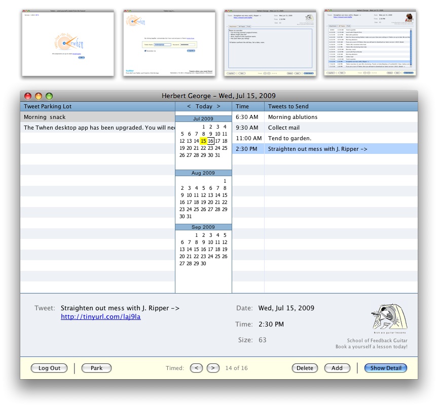
The outcome was a parking lot, a calendar, a list of list of timed reminders, a few fields for creating a new tweet, and the Park/Unpark and Show/Hide Detail buttons. The unit of measure for this app became tweets rather than reminders. This was because of Twitter's popularity and use of the tweet term, but also because it turned out in use cases, not all items delivered by the app were reminders. A more generic name was needed and tweets were well known and trusted.
When the detail of a tweet was revealed by Twhen, the user was able to add a 3,500 character attachment to his 140 character tweet. Handling of html and some textile markup language was to be supported. Attachments would be given a link in the body of the tweet. Twhen would even supply its own shortened URL service (to be called Twhez) to do this.
Additionally, a list of all timed Tweets and the user preferences were shown in the details of the tweet record. This kept the user interface very compact and easy to access. Everything was within the same window, even the about box.
In the second week of development, the desktop application was built out using a local data repository. It was through this process that the data model and requirements for the database were created. In the next article to be published in this three part series, the process of creating the client services application is revealed.
Business Decisions
The biggest business question for most developer/business people:
What should I charge?
Charges for a product are the confluence of three factors: costs, anticipated demand, and comparable pricing (or what the market can bear). This can be different for a new product which only becomes profitable when the number reaches a certain threshold. Twhen is such a product and needs a large user base quickly. Thus, a special pricing strategy is needed to build in a sense of urgency.
Another factor has come into play during the last two years: advertising. Desktop Twitter clients, in particular, often have tasteful, single advertisements within them to keep the price to the user low. Using advertising alone, however, presents considerable risk to the developer since the effort to sell ads or work with an ad broker is almost a separate business fraught with unknowns and devoid of givens.
The only real costs for an application such as Twhen would be hosting and bandwidth and ongoing application support. There would be no packaging, shipping, office expenses. Not even a paperclip. The app itself would need to store a user's tweets, attachments, and shortened URLs. The app would also need its own website for support, promotion and information.
To save time to market using a hosted, templated web site would be advantageous. Squarespace was chosen for its high-performance and breadth of features. Searchable FAQs, blog, forms, modifiable templates all made it an excellent choice.
The http://twhen.com site was used in conjunction with a Revolution-developed CGI to present an innovative pricing model designed to create immediate response. Pricing for Twhen begins at $1.00 USD a year per user for the first 100 users – and goes up a penny for every 10-user increment after that, until it reaches $5.95. After the pricing reaches $5.95, it goes up to it's retail value of $9.95 a year per user.
This incrementally priced product idea was pioneered by Pinboard, an alternative delicious styled bookmarking service. Until this model was popularized, the Twhen developer was going to follow the herd and use a trial period. It turns out that trialing can be expensive and adversely effect system performance with non-serious users, which is fine if there is adequate capital and staff. One person and no investment capital is not staffing appropriate to any trialing scenarios for a hosted service.
Just as features from one app cannot just be transplanted into another app without regard to its technical and business appropriateness, neither can a pricing model or feature be lifted without the same forethought.
Finally, the determination on trials for Twhen came down to one question:
How many users does a developer need to be successful?
Without taking investment capital, that number if relatively low. In the case of Twhen, that number is considerably under 10,000 users in the first year.
A Client Application is Born
The simultaneous wearing of design, engineering and business hats by the developer of Twhen brought forth a surprising result: a small, easy-to-use application with few moving parts that was priced to draw attention and response.
One might say, the restrictions imposed at the onset of this project were the mother of invention, as it were. By continually living within those boundaries and not following design, technical and business features borrowed without testing them against those boundaries, the result was as beneficial to the developer/business entity as it was to the end user of the product.
It is of interest that once in beta, Twhen attracted the attention of an author who wanted to publish a novel using it, a guitar teacher who desired a method to publish his guitar lessons via video, and a team of guides at a laser tag facility wanted to coordinate their activities via tweets. All of these parties paid reasonable, but substantial fees to have Twhen modified to meet their needs. This was an unanticipated source of funding for the commercial development effort.
In the next article, we will apply the same rigor to review the development of the client services layer of our three-tiered Twhen architecture.
Appendix of Technical Details aka Developer Notes
Log in:
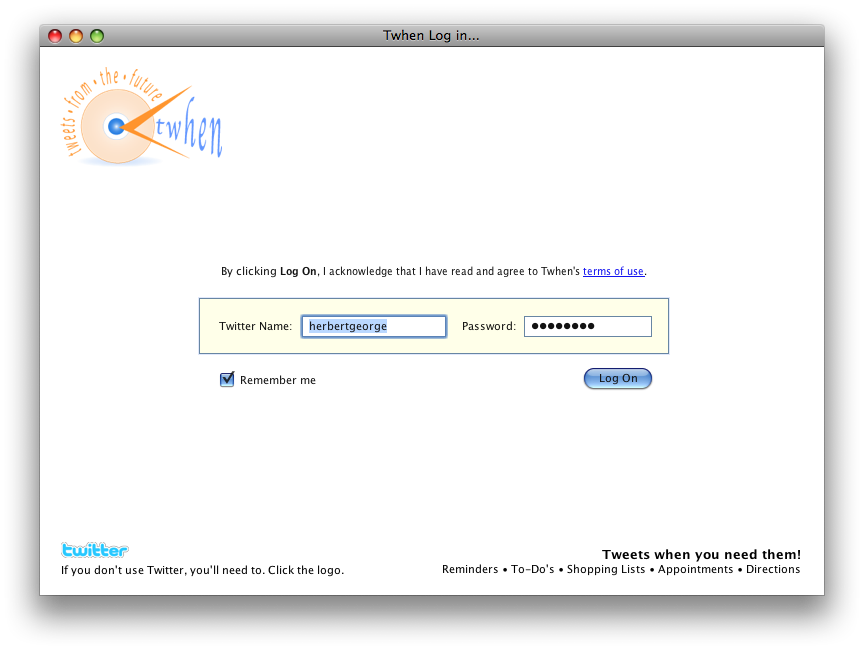
Since the user would need to be a user of Twitter to receive Twhen's tweets, the log-in process required a valid Twitter name and password combination. A Twitter logo and link to obtain log-in credentials were included on the screen for user's who had not yet set up a Twitter account. (NOTE: People don't have to be "on Twitter" to have a Twitter account. If they set up a private Twitter account, they can use it simply to tweet themselves from Twhen.)
The iPhone password entry method was used so the user could always see the last char typed, but none other. This was done using a hidden field that captured the actual char being typed, whereas only a bullet appeared in the visible password field.
Once the Log In button was clicked, the Twitter API would be used by the Twhengine (name for the Twhen backend) to authenticate users. Branding and terms of use information was also included.
NOTE: there is an Easter egg on the log-in screen.
The Main Screen:
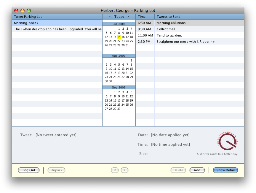
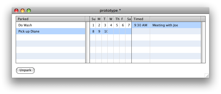
The Tweet Parking Lot and Tweets to Send components were built with Revolution's datagrid object. These objects are ideal for prototyping as the Revolution property inspector makes them easy to set up and fill with dummy data. Hidden columns contain the unique IDs of the tweet records these lists abstract. When a line item is clicked, this hidden ID is used to retrieve the record. These IDs would later be generated by Twhengine.
Over the years of its existence, Revolution archives have accumulated countless discussions and samples of work done on calendars. Putting together a three month calendar was easier than anticipated and a good warm-up for the work that had to be done later on Twhengine's system of notifications.
Clicking on a calendar day uses the date as seconds to filter the list of all of a user's tweets and show only the day's tweets. As Twhengine developed, it took over this function. Interestingly, all time zone information was gleaned from the user's Twitter settings via the Twitter API. Again, this code was moved from the desktop to the server and Twhengine took over this function in the following week.
Clicking the Today text at the top of the calendar selects the current day. Click the < and > text to move the calendar forward and backward one month. Many calendar systems offer monthly, weekly and daily views. The daily views show blank spots in schedules forcing the user to scroll up and down to find appointments and such. The vast majority of users don't need all that work, all those choices, and all that clutter.
NOTE: the fewer moving parts a system has, the better chance it has of running without defect.
The actual record fields for a tweet are few in number: only what is needed. The tweet itself (140 char limit as tracked by the size field seen above) is the primary piece of information. Rather than use a pop up calendar or some other clever artifact, the user need only enter the number of the day and tab out. 90% percent of the time, the user was referencing a date within the current month and this greatly reduced the effort needed to indicate a date. Just about anything a user typed would become a date.
NOTE: in Twhen's initial offering, only US date formats are supported for entry. If requested, other formats will be supported and deduced from Twitter settings if possible so as to keep Twhen preferences to a minimum.
The ad on this page changes each time the user clicks the Show Detail button. Ads supplement the revenue generated by Twhen's small yearly fees and offer a fairly unique advertising opportunity.
The same no-nonsense approach to entering time was used. When it's morning and you enter 10 in the time field, you'll see 10:00 AM in the time field after you tab out. There is no two field entry system with up and down arrows. There are no 10:03 times. Everything is on the quarter hour. This makes life easier for the user and drastically reduces the "moving parts" factor.
NOTE: If you are timing your life by the minute, you're not getting anything done.
Along the bottom of the screen are the navigational controls, the CRUD (create, read, update, delete) function buttons and the Show/Hide Detail button. Log Out hides the Detail and takes you to the Log In screen. Park and Unpark simply insert or remove date/time from a tweet record and then redraw the Tweet Parking Lot and Tweets to Send. The < and > buttons at the bottom middle of this screen take the user to the previous and next records in the total list of parked or timed tweets, depending upon which list has the focus.
The Delete button just deletes the current record after asking user permission. Holding down the option or alt key while clicking will skip the permissions and just delete straight-away. The Add button is more interesting. When the record is dirty, it shows the label Save, when the record is clean (unaltered) it is labelled Add.
Clicking Show Detail on this screen will slide the tweet record upward, revealing the attachment while offering access to the entire timed tweet list and user preferences.
Detail
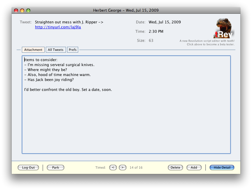
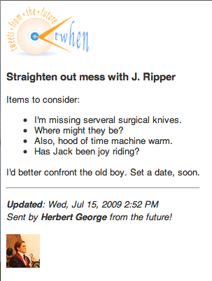
As noted previously, the attachment field will take up to 3,500 characters of text, html, texttile or a mix of all three. After leaving this field, a shortened URL to the attachment is created and added to the tweet field and the page itself becomes an HTML page. Video embed code can be place in the attachment field and when the link in the tweet is clicked (either in the delivered tweet or in the tweet field above), your web browser is opened to a page with your attachment as seen directly below.
Rendered attachments look fine on either a standard web browser or a mobile browser ala the iPhone.
When the All Tweets tab of the Detail screen is clicked, a list of all timed tweets is shown.
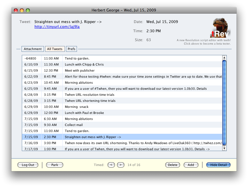
Clicking on any line item in this list will display the record the the space above. All of the buttons at the bottom of this screen work exactly as they do when the detail is hidden.
When the Prefs tab of the Detail screen is clicked, these user preferences show:
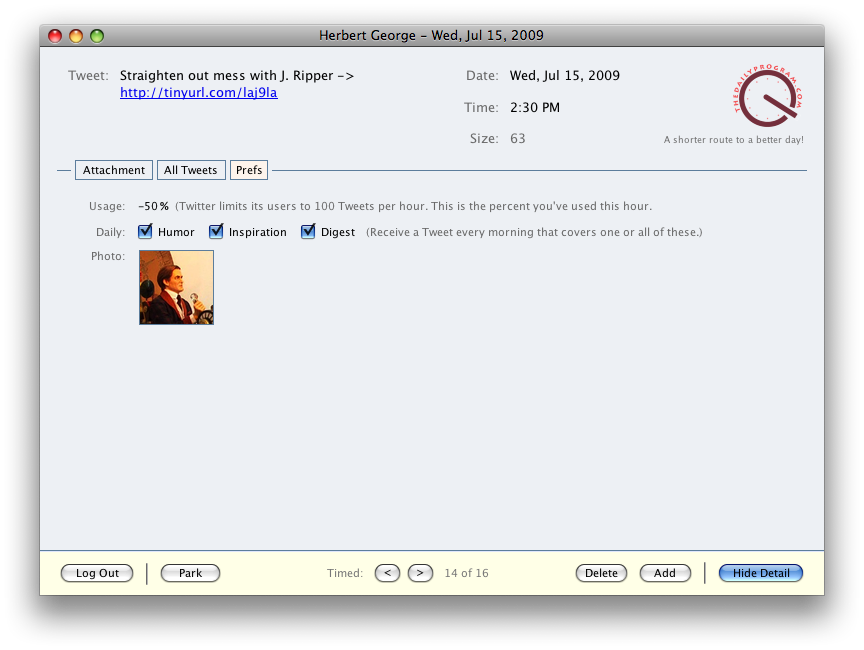
As a user, you are allow 100 calls to the Twitter API every hour. This is tracked by percentage in the Usage field. Twhen would also feature the sending of a daily joke, inspiration and/or digest of Tweets to be sent and Tweets in the parking lot at the beginning of a user's day. Lastly, in the prefs area a picture of the user taken directly from his Twitter settings would be place here, as it would also appear at the bottom of any Tweet attachment added by the user.
Clicking Hide Detail button on this screen will slide the tweet record downward, hiding the attachment, timed tweet list, and user preferences.
 |
|