
| Issue 144 | November 23rd 2012 | Contact the Editor | How to Contribute |
|
| ||
|
Custom Controls One of the most useful features of LiveCode is the ability to group controls and view them as a single object. In this lesson, we demonstrate how to use a group as an custom control in LiveCode, while constructing a scrollbar. What is a LiveCode custom control?The idea of a custom control in LiveCode is similar to the idea of an "object" in programming languages such as Java. A custom control is a group whose functionality is entirely encapsulated within itself, and which doesn't affect its environment in any way. Using custom controls in your programs has many advantages, two of the most significant are increased modularity of the program, and the greater ability to re-use code between programs. A well designed custom control can be copied and pasted into any application and will be ready for use almost immediately. Over time you can build up a library of controls which will greatly speed up programming. The modularity helps when debugging your application, because a custom control is insulated from errors in other parts of the program, and likewise, the rest of the program is insulated from errors in the control. Groups and Group ScriptsA simple and effective way to write a custom control is to make use of the group script, and have a single handler that updates the control based on its state. The state of the control is the only thing that the "outside world" knows about it, and custom properties in LiveCode are an ideal way to express this. Below we show how this idea can be used to create a scrollbar control that can be used in exactly the same way as the default LiveCode scrollbar, with the advantage of being fully customizable. Using this control it is possible to have "skinned" scrollbars throughout your program in no time at all! Creating a custom control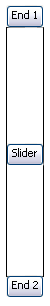
The first thing to do is to create your custom control by dragging the fields, buttons etc that you require into your program, naming them, and grouping them. For the scrollbar, create three buttons "End 1", "End 2" and "Slider" and an image area called "Background". Group these four controls and call the group "Scrollbar", don't worry about arranging or resizing the controls. Now open the script of your new custom control and lets begin. The state of the custom controlThe state of the custom control is the first thing to set up. The state will consist of a number of local variables, and a number of getProps and setProps to allow the rest of the program to manipulate them. We need to consider what properties the control should have. With the scrollbar this is easy, because we can just drag a LiveCode scrollbar control from the tools palette into the stack and examine its properties in the inspector. Essential propertiesThe essential properties of the scrollbar are - Orientation: whether the scrollbar is vertical or horizontal There are also some other properties that will help make the scrollbar more customizable: - Line increment: how much to scroll when the user clicks on the scroll buttons So we use the variables sOrientation, sStartValue, sEndValue, sThumbSize, sThumbPosition, sLineInc and sPageInc. These are declared at the top of the group script, outside any handler. Using setProp and getProp handlersNext we write setProp handlers for each variable. It is a good idea to comment these handlers explaining what the format of each variable should be. It is sensible also to check the input is correct to help find errors and keep the state of the scrollbar valid. Below is the setProp and getProp for the scrollbar's orientation. setProp cOrientation pValue getProp cOrientation The update functionOnce all the properties of the control are set up in this manner, we can write the "update" function, which simply needs to take all the variables and set the scrollbar up correctly. This function should consist of the following steps: - Verify all the parameters are valid Also it is very useful here to add an update lock to the control. This enables multiple changes to be made to the control's state without needing to update many times, because the update handler may become quite large in more complex custom controls. The update lock requires another variable "sUpdateLock" and a setProp as follows: setProp cUpdateLock pValue if pValue then if sUpdateLock is 0 then If we add an if statement to the top of the update handler that exits the handler immediately if sUpdateLock is not zero, then this effectively means we can set all the properties and then only call update once when we are done. on updateScrollbar Setting up the scrollbarOnce the update handler has been written, all that remains is to handle the scrollbar's user interaction. This requires writing mouseDown, mouseUp and mouseMove handlers, plus a few more to fine tune the interaction. These handlers should set the properties of the scrollbar, thus causing it to update, rather than manipulate the controls directly. It is relatively straightforward to write the remaining code, and if done correctly, the scrollbar can now be configured using a handler similar to this, in the script of the card that you wish to use the scrollbar on. on scrollbarSetup pBar Note: pBar is a reference to a scrollbar group, for example the long id of group "Scrollbar" Using the scrollbarWhen the scrollbar is used, its cThumbPosition will be set to the same value as if it was a standard scrollbar in LiveCode, so that if you are already using a standard scrollbar in your program, it will be very easy to change your code to use a custom scrollbar group. The key to this design is the fact that the custom control has a minimal interaction with the rest of the program. Its state can be changed, but no other messages need to be passed, and no shared variables are used. You can easily use the place command to duplicate the control across your whole stack, and can with equal ease use the scrollbar in many different stacks. There are many ways to extend this custom control, if you download the stack attached to this lesson you can experiment. A very easy and useful extension is to give the scrollbar group default values for all its properties, which are stored as constants in the script. These default values can then be used if any of the scrollbar's properties are not set, allowing a scrollbar to be created without any initialisation.

|